Choosing Color Contrasts for Visually Dynamic Interiors Successfully
Color contrast is the engine of compelling interior design. Without it, a room risk looking flat, uninspiring, and sterile. When applied intentionally, color contrast has the power to reshape architectural proportions, guide the human eye to specific focal points, and inject energy into ordinary spaces. Achieving a visually dynamic interior requires moving beyond basic color matching; it demands a strategic mastery of color relationships, light reflectance values, and structural balancing acts.
Many homeowners struggle with contrast because they equate it with chaotic vibrancy. They worry that introducing high contrast will make a home feel loud or uncomfortable. Successful interior design proves the exact opposite. By understanding the mechanical principles of how colors interact, you can deploy bold, dynamic contrasts that feel sophisticated, grounded, and entirely unified. This guide provides a comprehensive framework to execute color contrast successfully within your home.
The Pillars of Interior Contrast
To create a dynamic space, you must first understand that contrast exists in several distinct forms. A professional designer manipulates multiple types of contrast simultaneously to build depth within a room.
Value Contrast
Value contrast refers to the relationship between light and dark elements, independent of the actual colors used. This is the most crucial form of contrast in interior styling.
-
High-Value Contrast: Pairing an ultra-dark charcoal gray with a crisp, bright white creates sharp boundaries. This approach defines clean lines, making it perfect for modern minimalist settings or high-impact entryways.
-
Low-Value Contrast: Pairing colors of similar lightness, such as soft sage green with a muted lavender, creates a gentle, subtle transition. This approach is ideal for bedrooms where rest is the primary function.
Hue Contrast
Hue contrast relies on the position of colors on the color wheel. The further apart two colors sit on the wheel, the higher the structural contrast between them.
-
Complementary Pairings: Combining colors directly opposite each other on the wheel, such as deep navy blue and warm amber orange. These pairings naturally intensify one another, making the blue look deeper and the orange look warmer.
-
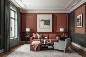
Split-Complementary Pairings: Selecting a base color and pairing it with the two colors adjacent to its direct complement, such as choosing emerald green and accenting it with soft terracotta and dusty rose. This strategy offers high visual energy but feels less aggressive than a direct complementary scheme.
Saturation Contrast
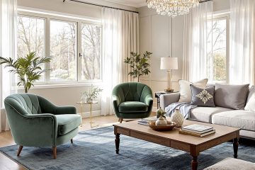
Saturation contrast involves pairing a highly vivid, pure color with a dull, muted, or grayed-down version of a similar tone. For instance, placing a vibrant royal blue velvet armchair against a backdrop of muted, slate-gray walls allows the chair to pop dramatically without overwhelming the room with intense color surfaces.
The Structural Strategy of the Three-Zone Ratio
When executing high-contrast palettes, maintaining structural balance is essential. If you distribute two high-contrast colors equally at a fifty-fifty ratio, the room will feel highly competitive and chaotic, as if the walls are closing in. To prevent this visual tension, apply the sixty-thirty-ten rule to your contrast strategy.
Establishing the Grounding Canvas (60 Percent)
The largest surface area in the room should be occupied by your primary backdrop color. In a dynamic interior, this is typically a low-intensity neutral or a soft, muted tone. This sixty percent canvas covers the main walls and large floor coverings, acting as a visual buffer zone that gives the eyes a place to rest.
Introducing the High-Contrast Disruptor (30 Percent)
The secondary color carries the weight of the contrast. It should provide a clear, undeniable counterpoint to the dominant canvas. Apply this thirty percent element to primary accent furniture pieces, built-in cabinetry, window treatments, or structural feature walls. If your main walls are a bright off-white, your thirty percent element could be rich espresso wood tones or deep forest green cabinetry.
Injecting the Vibrant Spark (10 Percent)
The remaining ten percent is reserved for your highest intensity accent color. This element provides the unexpected spark that completes the dynamic composition. Use this shade on small accessories, unique light fixtures, throw pillows, or curated artwork. The beauty of the ten percent element is its portability; it can be updated easily as your style preferences shift over time.
Navigating Contrast Across Architectural Layouts
The physical layout and lighting conditions of your home heavily dictate how color contrasts perform. A strategy that works in a closed dining room may fail entirely within an open-concept living space.
Managing Transitions in Open-Concept Zones
In homes featuring open-concept layouts, establishing contrast requires careful zoning. Since structural walls do not separate the kitchen from the living room, you must utilize contrast to define functional areas.
-
Island Accents: Keep the perimeter kitchen cabinets matching the light tone of the living room walls, but paint the central kitchen island a stark, contrasting dark tone. This anchors the cooking zone visually within the larger open space.
-
Rug Boundaries: Use highly contrasting area rugs to create distinct boundaries. A dark, texturally rich geometric rug can frame the living room lounge area, while the adjacent dining zone remains light and airy.
Balancing Natural and Artificial Light
Light alters the perception of contrast dramatically. Before finalizing your high-contrast selections, audit the room’s exposure.
-
Bright Exposures: South and west-facing rooms receive intense, direct sunlight that washes out subtle color differences. In these spaces, you must increase the value contrast gap to prevent the colors from bleeding together into a flat look.
-
Dim Exposures: North-facing rooms receive cool, flat light all day. High contrasts involving cool tones like stark white and black can look incredibly harsh or gloomy here. Instead, lean into warm-toned contrasts, such as cream paired with deep walnut or rich burgundy.
Textural Contrast as a Color Amplifier
Color contrast does not exist in a vacuum; it is heavily influenced by the texture of the materials carrying the hue. Glossy, smooth surfaces reflect light, making colors look sharper and brighter. Matte, rough surfaces absorb light, softening the appearance of the color.
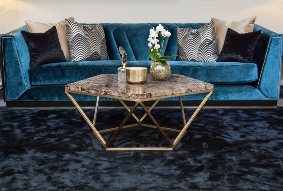
When pairing a light wall with a dark accent piece, consider the material finishes. Placing a matte black iron console table against a smooth white wall creates a crisp, graphic silhouette. Conversely, placing a plush, dark navy mohair sofa against that same wall introduces a softer, luxury contrast that feels physically inviting rather than purely architectural. Mixing textures ensures that your color contrasts look three-dimensional rather than flat.
Frequently Asked Questions
What is the difference between simultaneous contrast and successive contrast in design?
Simultaneous contrast is an optical phenomenon where the human eye changes the perception of a color based entirely on the color immediately surrounding it. For example, a neutral gray square will look noticeably lighter when placed on a black background, but will appear darker when placed on a white background. Successive contrast occurs when looking at a highly saturated color for a long period creates a temporary color afterimage when you look away, which can cause visual fatigue if a room relies on excessive pure color fields.
How can I determine the light reflectance value of a paint color to manage contrast levels?
Light reflectance value is a standard industry scale printed on the back of most major paint swatches or listed in the manufacturer online catalog. Running from zero to one hundred, it measures the exact percentage of light a color reflects back into the room. To achieve a successful high-value contrast design, ensure the light reflectance values of your primary wall paint and your accent trim paint differ by a minimum of forty points on the scale.
Why does a high-contrast room sometimes feel small and boxy, and how do I fix it?
A high-contrast room feels small when dark accent colors are applied horizontally along the upper sections of the walls, which pulls the ceiling down visually. To fix this and restore a sense of spaciousness, orient your contrasts vertically. Paint baseboards, walls, and crown molding the same light color, but introduce contrast through tall, vertical bookcases, floor-to-ceiling drapery panels, or a singular vertical accent strip behind a headboard to draw the eye upward.
Can I create a successful color contrast scheme utilizing only neutral tones?
Yes, this approach is known as high-contrast neutral design and is exceptionally sophisticated. You can build a dynamic space without relying on vibrant primary colors by pairing pale cream, warm alabaster, or light ivory with rich charcoal, deep espresso, or dark obsidian. The key to making an all-neutral contrast scheme work is ensuring a vast spread in light reflectance values combined with an abundance of natural materials like stone, leather, and wood.
How does the choice of grout color affect the contrast performance of wall tiles?
Grout color can either minimize or highlight the architectural pattern of your tiling. Using a matching grout color blends the tiles together, creating a smooth, continuous surface feel with minimal contrast. Selecting a highly contrasting grout color, such as dark charcoal grout with white subway tile, frames every individual tile sharply, turning the entire wall installation into a highly dynamic, geometric pattern that serves as a focal point.
What steps should I take if my chosen high-contrast color scheme looks too aggressive after application?
If the contrast looks too harsh once the paint dries, you can soften the room environment without repainting by introducing transitional tones. Add mid-tone accent elements that bridge the gap between the light and dark extremes. For example, if a black-and-white room looks too stark, introduce camel leather chairs, medium-toned wood accent tables, or warm gray textiles to smooth the transition and ground the visual energy.
How do dark window frames impact the view out of a window compared to light frames?
Dark window frames, such as those finished in matte black or deep bronze, create a high-contrast outline that acts like a picture frame around the outdoor view. Because black absorbs light, the frame itself tends to recede from human visual perception during the daytime, drawing the eye past the glass window pane directly into the colorful outdoor landscaping. Light window frames reflect interior light, drawing attention back to the physical window structure itself.