How to Choose the Perfect Color Palette for Your Home
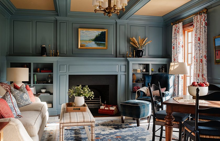
Color possesses a profound psychological power. It is the most immediate and cost-effective design tool available to transform the atmosphere of a residential space. A thoughtfully curated color scheme can make a cramped hallway feel expansive, inject energy into a dull home office, or turn a chaotic master bedroom into a tranquil sanctuary.
However, walking into a paint store and facing thousands of color swatches often induces choice paralysis. Selecting the right combination of hues requires more than just picking your favorite colors. It demands a strategic understanding of color theory, architectural lighting, structural transitions, and the specific functions of each room. This comprehensive guide provides a step-by-step framework to help you design a cohesive, sophisticated color palette that elevates your entire home.
The Fundamentals of Color Theory for Homeowners
Before selecting specific paint chips, you must grasp the basics of the color wheel. Designers rely on established relationship templates to create harmony and prevent visual clashing.
Understanding Color Relationships
The color wheel is organized by primary, secondary, and tertiary colors. How you navigate this wheel dictates the intensity of your home’s design.
-
Monochromatic Schemes: This approach utilizes different values of a single color family, varying the tints by adding white or shades by adding black. A monochromatic palette creates a sleek, contemporary, and deeply soothing environment.
-
Analogous Schemes: This method pairs three colors that sit side-by-side on the wheel, such as blue, blue-green, and green. Found frequently in nature, analogous palettes offer a casual, comfortable sense of balance.
-
Complementary Schemes: This style combines two colors directly opposite each other on the wheel, such as soft amber and deep blue. This high-contrast pairing creates dramatic, dynamic focal points and is best used in formal dining rooms or living spaces.
Deciphering Warm versus Cool Undertones
Every paint color belongs to a temperature family. Warm colors like red, orange, beige, and rich cream stimulate conversation and create physical coziness. Cool colors like slate gray, ice blue, and sage green encourage relaxation and lower heart rates.
The secret to a professional look lies in identifying hidden undertones. A clean white paint may possess a pink, yellow, or blue undertone that only becomes visible when painted across a large wall surface. Always match the undertones of your wall paint to the existing undertones of your fixed flooring and kitchen countertops.
Evaluating Architectural Lighting and Exposure
A paint color changes appearance drastically throughout the course of a day. The direction your room faces determines the volume and quality of natural light it receives, which directly influences how a color renders on the wall.
North-Facing Rooms
North-facing spaces receive a consistent, cool, and slightly bluish natural light all day. This cool wash can make cool grays and crisp whites look clinical, dim, or slightly muddy. To counteract this chilly light, opt for warm neutrals, soft beiges, or whites with yellow or peach undertones to balance the atmosphere.
South-Facing Rooms
South-facing rooms enjoy intense, bright sunlight from morning until late afternoon. This abundance of light amplifies color intensity. Soft, cool tones like pale gray, lavender, or light blue look exceptionally crisp here. Avoid highly saturated, bright yellow or warm beige tones in south-facing rooms, as the strong sunlight can make them feel overwhelming and hot.
East and West Exposures
East-facing rooms capture bright, warm light in the early morning, followed by cool shadows in the afternoon. West-facing spaces experience flat, cool morning light, followed by an intense, fiery orange glow as the sun sets. When painting these rooms, choose colors that perform well under both conditions, or prioritize the color based on the time of day you occupy the space most frequently.
The 60-30-10 Rule for Perfect Balance
To prevent a room from looking chaotic or overly sterile, professional interior designers utilize the sixty-thirty-ten rule. This mathematical ratio guarantees that your chosen colors are distributed evenly throughout the space.
The Dominant Color (60 Percent)
The dominant color forms the background canvas of the room. It typically covers the main walls, largest area rugs, and large sectional sofas. Because it occupies the majority of the physical space, this hue should generally be a neutral or low-intensity tone that allows other elements to breathe.
The Secondary Color (30 Percent)
The secondary color supports the dominant hue while introducing visual interest. It occupies roughly half as much space as the dominant color. Apply this shade to accent chairs, window draperies, built-in cabinetry, or a single statement accent wall. The secondary color should provide enough contrast to stand out against the main walls.
The Accent Color (10 Percent)
The accent color is the jewelry of the room. It provides a deliberate splash of vibrancy or sophistication. Use this color sparingly on decorative accent pillows, lampshades, small artwork, and floral arrangements. A high-contrast metal finish, such as brushed gold or matte black, can also serve as your ten percent accent.
Building a Cohesive Whole-House Palette
While individual rooms can have distinct personalities, the transition from one space to the next must feel intentional. A jarring shift from a bright orange hallway into a cool gray kitchen destroys the flow of the home.
The Flowing Neutral Strategy
Select one primary neutral color to serve as the unifying thread for the entire house. Paint this color in open-concept living zones, primary hallways, and major stairwells. By maintaining a consistent backdrop in these common connective areas, you can safely experiment with bolder, unique colors inside isolated spaces like powder rooms, bedrooms, and home offices without disrupting the overall architectural continuity.
The Ceiling and Trim Connection
An easy way to unify a home is to keep all trim, baseboards, window casings, and crown molding painted the exact same white finish throughout every room. For ceilings, avoid standard, flat ceiling white, which can look cold. Instead, paint the ceiling a diluted version of your wall color, watered down by seventy-five percent with white paint, to create a soft, custom canopy effect that eliminates harsh boundaries.
The Practical Selection and Swatching Process
Never purchase paint bulk orders based solely on how a color looks on a computer screen or a tiny two-inch cardboard swatch inside a retail store.
Utilizing Large Sample Boards
Purchase small sample pots of your top color choices. Instead of painting directly onto your existing walls, which can skew your perception due to the old color underneath, paint the samples onto large, white poster boards. Apply two full coats to ensure true color saturation.
The Movement Test
Move these painted sample boards to different walls within the room throughout the day. Observe the boards in the bright morning sun, the flat afternoon light, and at night under artificial LED lamps. Hold the sample board directly against your flooring, kitchen cabinets, and permanent furniture pieces to ensure the new color highlights your existing investments gracefully.
Frequently Asked Questions
What is the difference between paint hue, tint, tone, and shade?
A hue refers to the pure, unadulterated color origin on the color wheel, such as pure red or pure blue. A tint is created by adding white to a pure hue, making it lighter and softer, which results in pastel colors. A tone is achieved by adding gray to a hue, which dulls the vibrancy and creates sophisticated, muted historical colors. A shade is created by adding black to a hue, increasing the darkness and depth to produce rich colors like navy blue or burgundy.
How does the light reflectance value of a paint color affect a room?
Light reflectance value is a scale running from zero to one hundred that measures the percentage of light a paint color reflects. A value of zero represents absolute black, which absorbs all light, while a value of one hundred represents pure white, which reflects all light. High value paints reflect light efficiently, making small, dark rooms feel brighter and more spacious. Low value paints absorb light, making large spaces feel intimate, cozy, and dramatic.
Why does a paint color look completely different in a matte finish compared to a high-gloss finish?
The sheen level changes how light bounces off the wall surface. A matte or flat finish absorbs light, hiding wall imperfections and creating a velvety appearance where the color looks uniform from all angles. A high-gloss finish reflects light sharply, making the color look brighter, more vibrant, and highly saturated. Glossy finishes highlight every minor drywall scratch, making them best suited for durable trim and cabinetry rather than large wall surfaces.
How can I create a color palette if I live in a home with an open-concept floor plan?
In an open-concept home where walls are shared between the kitchen, dining, and living rooms, you must rely on architectural zoning. Use a single dominant neutral across the continuous walls to maintain architectural unity. Introduce distinct accent colors to define separate zones through furniture placement, island cabinetry finishes, unique tile backsplashes, and coordinated area rugs, rather than attempting to change paint colors abruptly on a flat wall.
What is the best way to choose a white paint that does not feel cold and sterile?
To find a welcoming white paint, look for options formulated with warm undertones such as yellow, cream, pink, or subtle gray-beige. Avoid stark, pure white paint bases that contain zero tint, as these reflect light harshly and mimic institutional settings. Test your white samples directly against your trim work and observe them at night under warm artificial lighting to ensure they maintain a soft appearance.
How can an accent wall be used to alter the perceived proportions of a long, narrow room?
If you paint the far, distant wall of a long, narrow room a dark, saturated color while keeping the side walls a light neutral, you will create an optical illusion. Dark colors advance visually, while light colors recede. Painting the end wall a dark shade brings it forward visually, making the room appear shorter, more balanced, and square, rather than feeling like a long, narrow corridor.